Saturday, July 28, 2012

Just For You - CR84FN Color Challenge

Hey, welcome to the weekend!  We finally have some normal temperatures here in northern Illinois.  The current temp is 78 degrees...at noon!  It's so refreshing :)

Anyway, I'm sharing a card that I've created using the beautiful colors over at the CR84FN Color Challenge - #59.
I love the inspiration photos, but coral isn't a color I use very often.  Not sure why.  But, I was so drawn to these photos that I just had to give it a try.  Oh boy.  It proved to be QUITE a challenge for me.  I struggled to decide which colors to use on the various parts of this card.  It took me most of the evening to complete this card.  Does that ever happen to you?
This is final result.


I'm so glad that I didn't give up.  Because, I'm thrilled with the results!  This turned out to be one of those cards that I keep looking at, every time I walk past it.  And each time I do...it makes me smile.

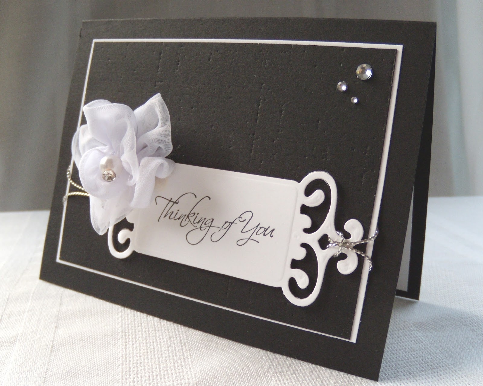
I used several dies for this card (the frame, the sentiment panel and one of the roses).  The die cut rose is popped up on dimensionals, then I added a few drops of platinum liquid pearls. I even pulled out my Versamark frost ink pad, to add a few subtle roses in the background.

Thanks so much for taking a look!  I'll list my supplies below.


Supplies:
card stock: early espresso, creamy caramel, sahara sand, calypso coral, whisper white (SU)
ink: calypso coral, creamy caramel, crumb cake, basic black (SU) dazzle frost and plain Versamark
stamps: rosie posie (PTI), just because (SU)
dies: fabulous frames, rosie posie (PTI)
other: platinum pearl liquid pearls (Ranger), early espresso baker's twine (SU), white thread, sewing machine, dimensional foam dots (SU)

Sunday, July 22, 2012

Happiness! - Embellish Mag Challenge

Hi!  I'm sharing a card that I created for the Dry Embossing, Color Trends Challenge over at Embellish Magazine.com.  They have gorgeous inspiration photos...always.  This challenge requires us to use dry embossing on our creation.
I knew that I wanted to use purple as the main panel of my card.  And that's where I would use dry embossing.  So.  That part was easy.  As for the rest of the card.  Ha!  I die cut and punched so many butterflies.  Then I played with placement.  Again, then again.  lol


Finally, I'm pleased with the final results :)  I added a few gems as a finishing touch.  I just now realized that my purple card stock is darker than the purple in the inspiration graphic.  Well, too late to start over now...

This card was created for a customer of mine, along with a coordinating pair of paper crafted shoes.  So, just for "kicks" (pun intended), I'm including a couple of photos of the set.


If you've been following my blog for a while, you've seen quite a few pairs of my paper crafted shoes lately.  I hope you aren't tired of seeing them!  Even though they're labor intensive, they really are so much fun to make.  Especially embellishing them!  It seems the more shoes I make, the more ideas I have.  And that's fun. :)
Thank you for taking the time to stop by!  I appreciate your visit and your comments.


Supplies:
card stock: very vanilla, concord crush, lucky limeade, primrose petals (SU)
stamps: beautiful butterflies (PTI)
ink: concord crush (SU)
other: wrought iron impression plate (PTI), love lives here dies, beautiful butterflies dies (PTI), butterfly punch (MS), purple gems (The Paper Studio)

Saturday, July 21, 2012

Thinking of You - CAS-ual Fridays Challenge

Hey there.  A very quick post to share a card I created for the current challenge at CAS-ual Fridays - CFC62.  Here's the graphic...
Create a clean and simple card using a black card base.

This is what I came up with...


And....just for fun, I'll share this last photo.
I bought these fancy fabric flowers in the wedding section of a local craft store, and I couldn't wait to use them.  The card is fairly straightforward.  I used my linen impression plate of the main panel of my card.  Placing that on a white mat.  I used a Spellbinders  die for the sentiment panel.  Then I added that satin and chiffon flower...it already had the little pearl embellishment in the center :o)
A bit of silver cord and 3 clear gems...and I was done!

That final photo is just for fun.  I know that the paper crafted shoes don't qualify as a card!!!  I created this set for a customer, but I thought I'd give you a peek at the entire set.

Thanks so much for taking a look!  I hope you'll leave a comment.


Supplies:
card stock: basic black, whisper white (SU)
ink: onyx black (Versafine)
stamp: kind & caring thoughts (SU)
other: linen impression plate (PTI), fancy tag (Spellbinders), silver cord (RRR), fabric flower (His & Hers Studio), clear gems (The Paper Studio)

Sunday, July 15, 2012

One Butterfly

Hello!
Well, you won't see a card (or a pair of paper shoes) in this post.  I interrupted my crafting to go outside and water a few potted plants.  And...pull a few of the gazillion weeds in the flower beds.  While I was out there I had a beautiful visitor.  I hurried inside to grab my camera.  But, I was sure my visitor would leave before I returned.  Ahh  :)  Still there!

I took 23 photos of him (or her?), but I managed to pair it down to 5 for this post....lol.


What did I tell you?  Gorgeous, right?

I don't know very much about butterflies, so if you can identify it, please leave a comment.  I would love to learn more about it!

Thanks for stopping to take a look today!

Sunday, July 8, 2012

Red Shoes - White Polka Dots

Hey!  I'm just popping in with a very short post, to share a pair of shoes and coordinating card that I've made for a customer.  These look very summery to me.  See what you think.

Lots of red and white, with just a touch of bling.  Those glittery brads are from Recollections (Michaels).  The card stock and the polka dot dsp are from Stampin' Up!.  The dsp is one of the prints in the Summer Smooches pack.  Love the scale of the little polka dots.  It doesn't overpower a card, like a larger print sometimes does.  There is such a variety in that dsp pack...so versatile.

Anyway, I've gotta go.  Hope you had a great weekend...I did  :)

Muddin' for Matt event

Hi all!
This post won't be about stamping...or papercrafting at all.  Just so you know :)

This is about MUDDIN'!  Muddin' For Matthew.
Our nephew Matthew would have turned 21 yesterday (July 7).  We lost Matthew to leukemia in May of 2010.  His family decided to hold a birthday party/tribute/fundraiser in honor of Matthew's 21st.  Let me tell you.  It was everything that Matthew loved.
He loved dirt, mud, water and going fast through all of the those elements!  Play Hard and Never Give Up was his motto.  He did exactly that.
So...yesterday was a party that included a LOT of playing hard!  I have to admit, I was brought to tears more than once yesterday.  But, I smiled and laughed and smiled even more.

Are you ready for a lot of photos?  Go get a cold drink, sit back and relax...ok?

CureSearch is one of the foundations for which funds were donated.

Hunt of a Lifetime is the other foundation that funds are going to.
Both of those are wonderful foundations.  Doing so much for so many kids.

Lee - he was a very close friend of Matthew's.  He is still close to all of us Wittwer's.

Matthew's sister, ready to get muddy.

Getting ready to roll.
Do you see that spray of mud below the one orange flag?  Matt's Dad got soooo stuck!
Matt's uncle Tim...also stuck!

The tractor got used to pull vehicles out of the mud.  See that pickup truck?  It's actually red, underneath the mud.

The red truck.
Our sis-in-law with a mud "tattoo" courtesy of her son!

Near Matthew's car, we found this heart shape in the grass.  The grass is dark, but not burned.  It remains a mystery.  But I have my own theory.
And later in the evening...burnouts on the country road.  These were made by Matthew's car.  Matthew loved burnouts!!!   And yes...we made sure there was no other traffic on the road.


And this is a video I took (and I'm not very good at this) of one of the burnouts.  We had a wonderful time celebrating Matthew's life and the way he lived it.  He was such a strong young man.  I'll always admire him! I'm so blessed to be a member of this Wittwer family.  They're amazing.

If you stayed all the way through this blog post...Thank You!
Oh.  By the way.  This is as  muddy as I got yesterday.  Yup, I'm a wimp :)


Saturday, July 7, 2012

Just a note - 2 challenges

Hello!  I have a card (and a project) to share this morning, but this will be a quick post.  We'll be heading out to a 21st birthday party/tribute.  Our nephew Matthew, who died of leukemia two years ago, would have turned 21 years old today.  His family wants to celebrate his life and the way he lived his life.  So that's what we'll do today.  His motto was "Play Hard and Never Give Up".  Matthew LOVED the outdoors.  And he especially loved dirt, mud, snow...and any vehicle that would go fast through those elements.  So we'll be Muddin' for Matt today.  My BIL and SIL have acres of woods behind their farmhouse, with lots of trails.  And I got a sneek peek of the trails (we avoided the muddy ones) yesterday.  It's so cool!  Matthew would approve :)

Anyway, I said this would be a quick post, didn't I?

My card today, is going into 2 challenges.

retrosketches  re#19

CAS-ual Fridays CFC60 - use text in your clean & simple design

This is how I combined the two challenges.


I loved this sketch, and I could see that it would work so well with the "text" challenge.  And, I think it did!
I used a book print impression plate on the main panel.  Then stamped the little note book panel with the postmarks background stamp.  Then just added the "just a note" sentiment to the little page.  So fun :)
Oh.  I almost forgot.  This card and the project below is going to a customer of mine.  Just for fun, I'm including a photo of the coordinating shoes that I created for her.
I used pieces of acetate for the toe box of each shoe.  I love the results but, oh my...that stuff is difficult to work with.  Have you ever tried to score and fold acetate?  Anyway...project completed!
Thanks so much for stopping by!


Supplies:
card stock: blushing bride, whisper white (SU), acetate for the shoes was recycled from stamp packaging
ink: blushing bride (SU), onyx black (Versafine)
stamps: bb:postmarks, happy trails (PTI)
other: lace (from my stash), book print impression plate (PTI), spiral edge punch (SU), pearls (Recollections), foam tape, scor-tape

Thursday, July 5, 2012

Hello... retrosketches challenge #13

Whew...is it hot in northern Illinois!  So.  I stayed inside most of the day yesterday.  Crafting!
We did go out to our back yard last night to watch the fireworks though.  So cool!  We are just 2 miles from town.  With only one house and a cornfield between us and the park where the fireworks were displayed.  No parking problems for us :o)

So.  I've got a card to share.  This will go into the current challenge at retro sketches #18.

My card ~


I have to admit, this sketch was "challenging" for me.  It took me so long to come up with an idea, but I'm pleased with the results.  I used some new Stampin' Up goodies.  I used the designer vintage faceted buttons, the summer smooches brads and lucky limeade card stock.  Oh, and the chevron dsp is from the new summer smooches dsp pack.
I added some texture to the white panel with a PTI impression plate.

In the third photo you'll also see a pair of paper crafted shoes to coordinate with the card.  I've created this set for a customer.  You'll see a few more sets soon, as I work on this order.  It's so much fun for me!

Thanks so much for taking a look!  I hope you'll leave a comment :o)


************

What's in it?
card stock: lucky limeade, whisper white (SU)
ink: onyx black (Versafine)
stamps: communique curves (PTI)
designer series paper: summer smooches
other: summer smooches brads, designer vintage faceted buttons (SU), linen impression plate (PTI), rhinestones (Recollections), white ribbon (Michaels)

With Sympathy - Color Hues Challenge

 I'm playing along in the current challenge at Color Hues #83 Cream and Blue challenge.  The inspiration provided by the design team we...